 MegaMegaTypeType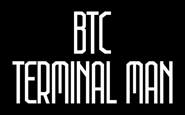
A condensed sans-serif in four weights, built for maximum vertical presence in layouts with limited horizontal space, inspired by the sterile mechanical aesthetic of The Terminal Man.
About
Rigid and upright in structure, the typeface is designed to stack type aggressively, prioritising height and density over horizontal spread. Its reference point is the early intersection of computing and clinical design, giving it a cold, functional character suited to space-constrained environments. Four weights allow the designer to push further into condensed or heavier territory depending on context.
Classification
A condensed sans-serif with a rigid, vertical structure. Its mechanical, high-density aesthetic and upright stroke rhythm place it firmly in the condensed grotesque tradition.