 MegaMegaTypeType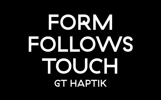
A monolinear geometric grotesque whose uppercase letters and numerals were designed for tactile legibility, readable by touch alone.
About
Originally released in 2010 and expanded in 2014, GT Haptik draws on an unusual brief: uppercase letters and numbers optimised to be distinguished by fingertip rather than eye. The seven weights run from Lazer to Black, each with Oblique and Rotalic companions, and alternate characters plus proportional and tabular figures are included throughout. The monolinear construction gives the family a clean, even tone suited to editorial and identity work where the geometric grotesque vernacular is wanted without excessive neutrality.
Classification
Described explicitly as a monolinear geometric grotesque; uppercase letters and numbers were designed for tactile legibility, reinforcing a geometric, even-stroked construction throughout.