 MegaMegaTypeType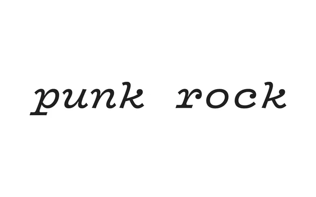
A warm, characterful monospace family drawn for the band Vulfpeck, rooted in the IBM Selectric Light Italic and distinguished by flexed strokes, ball terminals and expressive italics.
About
James Edmondson designed Vulf Mono at the request of Vulfpeck's bandleader, expanding what began as a single bolder interpretation of the Selectric's Light Italic into a full family of weights and italics. Slightly concave edges introduce a subtle flex to each stroke, softening the mechanical rigidity typical of monospace design and evoking the imprecision of typewriter printing. The result shares qualities with Eames Century Modern – bracketed serifs, flexed lines, a retro warmth – while remaining technically suited to coding environments, where a code-optimised variant with a slashed zero and alternate glyphs is also available.
Classification
A monospaced typeface with prominent slab serifs and ball terminals, inspired by the IBM Selectric Light Italic typewriter font. The consistent glyph width, bracketed serifs and flexed strokes place it firmly in the typewriter-derived slab mono tradition.