 MegaMegaTypeType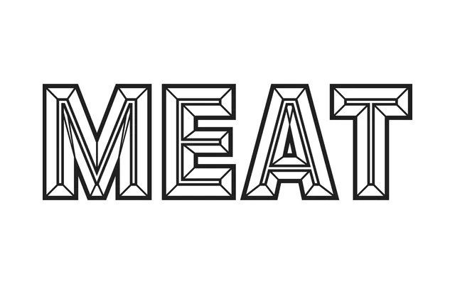
A chromatic, all-caps industrial sans from Alex Sheldon built around 12 stackable layers that synthesise 1960s signage lettering with the dimensional excess of late 19th-century wood type.
About
Distributed through Sheldon's Match & Kerosene foundry, Detroit offers 12 distinct layer options including bevels, drop shadows split into two parts for added depth, prismatic fills and outlines, many of which hold up independently as well as in combination. The foundational letterforms are solid enough to function as a straightforward industrial display face, with alternate glyphs featuring rounded corners and dropped crossbars that push further into 1960s Americana territory. Some manual adjustment is needed when pairing the outline layers with drop shadows, as the two do not align automatically.
Classification
An all-caps industrial sans designed explicitly for chromatic layering, with 12 distinct layer options including bevels, shadows, prismatic and outline variants. Its display-only nature and layering system place it firmly in the display category, with roots in 1860s–1900s chromatic wood type and 1960s signage lettering.