 MegaMegaTypeType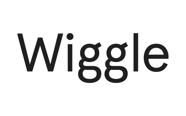
A 2010 grotesque by The Entente that sits uneasily between neo-grotesque restraint and older grotesque quirkiness, most recognisable for its bulbous double-bowled 'g'.
About
Distributed by Colophon Foundry, Aperçu draws on Neuzeit and Franklin Gothic to produce a low-contrast sans with angled terminals, hunched shoulders on the 'n' and tight apertures that resist neat classification. Its loose, slightly deformed quality makes it adaptable across playful and stripped-down settings alike. A monospaced variant carries much of the family's personality into a more formal register.
Classification
Aperçu blends neo-grotesque characteristics — low stroke contrast, tall x-height — with older grotesque traits such as the double-bowled 'g' and angled terminals drawn from Franklin Gothic, placing it between the two genres rather than firmly in either camp.