 MegaMegaTypeType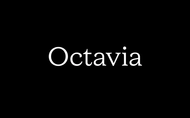
A low-contrast serif in the spirit of 1940s and 1950s film noir titles, built to hold up in reverse at small sizes.
About
Octavia takes its nostalgic charm from film noir title and end-credit lettering, with an open colour designed for optimal readability against dark backgrounds. A single Regular style is out now, with a full sixteen-style family from Hairline to Black planned.
Classification
A low-contrast serif modelled on 1940s and 1950s film noir title and end-credit lettering, built for legibility at small sizes against dark backgrounds.
Weights
Regular
Languages
Latin
Tags
seriflow-contrastfilmvintageeditorial