 MegaMegaTypeType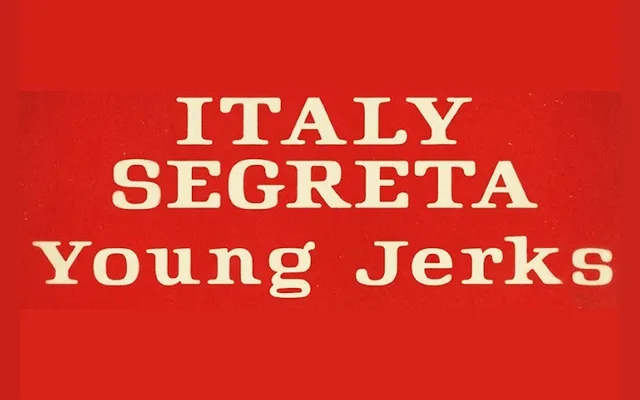
A sturdy, low-contrast serif drawn from the functional lettering of MPAA film rating cards, balancing legibility with a quiet human warmth.
About
Rated R takes its cues from the brief flash of lettering on film rating cards, translating that utilitarian clarity into a serif with modest stroke contrast and solid proportions. Subtle curves soften the directness of the design, keeping it approachable without sacrificing its matter-of-fact character. The 286-glyph character set covers major Western, Central, Northern and Eastern European Latin-based languages, with extended diacritic support.
Classification
A sturdy, modest-contrast serif with upright, information-first proportions and humanist warmth. The design sits between a workhorse text serif and a display face, inspired by the functional lettering of MPAA film rating cards.