 MegaMegaTypeType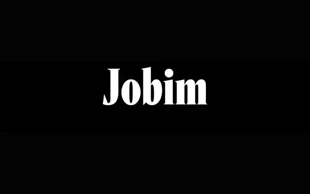
A brutal yet elegant headline serif reworking Vendome through the vernacular lettering of the Orfeu Negro poster.
About
Jobim takes Vendome as its primary reference, then swaps that revival's dynamic flow for a plainer, more orthogonal axis based on the poster lettering for Orfeu Negro. Currently released as a single Compressed Black style, with a 48-style family planned.
Classification
A headline serif drawing on the French classic Vendome, deliberately trading Vendome's dynamic flow for a more orthogonal, vernacular structure taken from film poster lettering.
Weights
Compressed Black
Optical sizes and widths
Compressed
Languages
Latin
Tags
displayheadline serifbrazilian designeditorialvernacular