 MegaMegaTypeType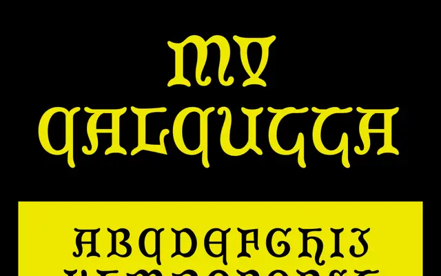
A display serif from Man Versus Type drawing on vernacular lettering traditions associated with Calcutta.
About
Man Vs Calcutta takes its name and apparent inspiration from the typographic culture of Calcutta, suggesting a design rooted in colonial-era or South Asian vernacular lettering. It sits within Man Versus Type's broader interest in historically inflected display typefaces. The foundry's output tends toward bold, character-driven designs intended for editorial and branding contexts.
Classification
A display serif with decorative or vernacular characteristics suggested by the Calcutta reference, likely drawing on South Asian or colonial-era lettering traditions. Categorised as display due to the ornamental nature implied by the name and foundry aesthetic.
Weights
Regular
Languages
Latin
Tags
displayserifdecorativevernaculareditorialhistorical