 MegaMegaTypeType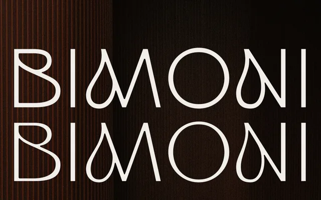
An uppercase-only display sans in two styles, one with even strokes and one with high contrast, intended for branding, headlines and packaging.
About
ED Bimoni offers two distinct cuts: No. 1 with balanced, even stroke widths for clean and stable compositions, and No. 2 with contrasting stroke weights that introduce visual tension. Both styles draw from minimal geometric forms with subtle organic curves, and include OpenType stylistic sets for alternate letterforms. The family is pitched squarely at high-impact display contexts such as logos, posters and editorial layouts.
Classification
An uppercase-only display sans with two stylistic variants distinguishing even and contrasting stroke weights. The geometric, minimal construction and strong contrast in No. 2 place it firmly in the display category rather than functional sans-serif.