 MegaMegaTypeType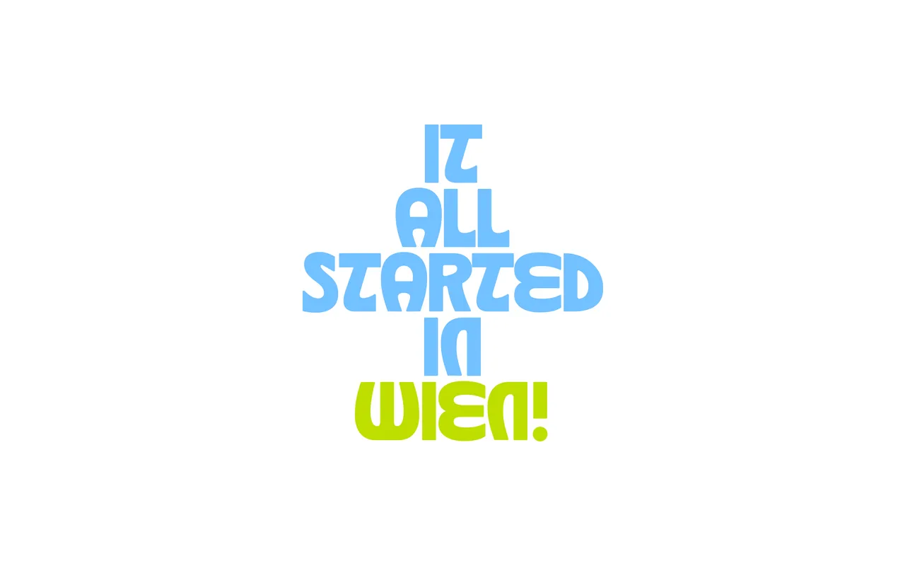
A display typeface drawing directly from the organic, calligraphic typography of the Vienna Secession movement, referencing works published in Ver Sacrum, Insel and Die Fläche between 1898 and 1910.
About
Designed by Eliott Grunewald, Wien takes its formal language from the Sezessionstil, the Austrian offshoot of Art Nouveau centred on Vienna and other cities of the Austro-Hungarian Empire. The typeface reflects the movement's characteristic blend of Gothic structure, fluid organic curves and a tight relationship between letterform and image. Its Latin extended character set supports a wide range of European languages, delivered in OTF, TTF, WOFF and WOFF2 formats.
Classification
A display typeface rooted in the calligraphic, organic forms of the Vienna Secession and Jugendstil movements of the early 20th century. Its fluid strokes, Gothic influence and decorative character align it firmly with historical display typography rather than any utilitarian category.