 MegaMegaTypeType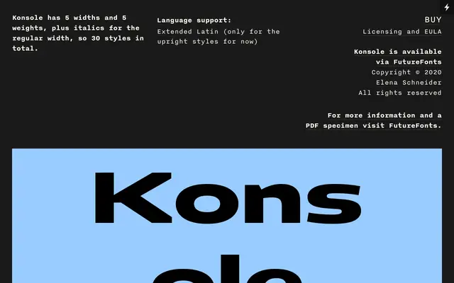
A work-in-progress grotesque spanning five widths and five weights, built as a flexible system rather than one fixed cut.
About
Konsole runs from Condensed to Wide across five widths, each in five weights from Thin to Bold, with italics currently limited to the regular width. It reads as a plain, neutral grotesque built for systems work, distributed through Future Fonts while still in development.
Classification
A neutral five-weight, five-width grotesque built as a system for text and structured information rather than a single expressive cut.
Weights
ThinLightRegularSemiboldBold
Optical sizes and widths
CondensedCompactRegularExpandedWide
Languages
Latin Extended
Tags
grotesquevariableworkhorsebrandingeditorial