 MegaMegaTypeType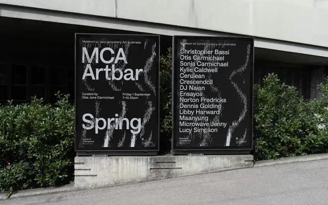
An elegant, reliable neo-grotesque drawing on Empire Gothic from 1912, across eight weights with full italics.
About
Four Grotesk aims to combine neutral and friendly shapes with an individual personality, an addition to the crowded neo-grotesque field rather than a plain workhorse copy of it. It spans Thin to Ultra with matching italics.
Classification
A neo-grotesque drawing on early twentieth-century grotesques, notably Empire Gothic of 1912, built to feel both neutral and individually recognisable.
Weights
ThinLightRegularBookMediumBoldHeavyUltra
Languages
Latin
Tags
grotesqueeditorialbrandingworkhorsevariable