 MegaMegaTypeType
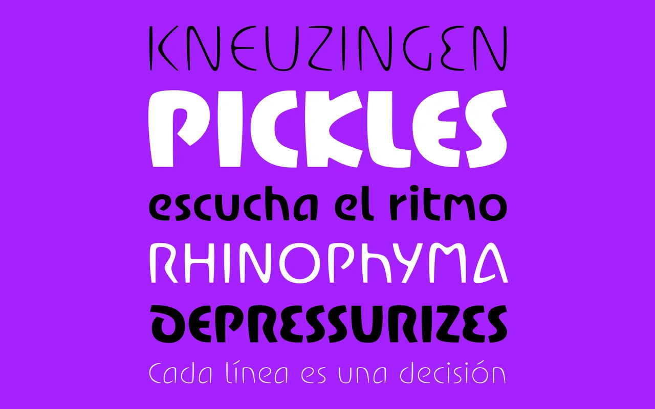
A display sans cut like lettering in stone, sharp corners worn soft.
About
Brazda comes from worn memorial inscriptions, where letters were cut into stone and filled with lead. That process leaves sharp notches next to softened curves, and the result feels solid but friendly. Six weights from a spidery Thin to a chunky Black.
Classification
Work in progress, sold through Future Fonts (beta 0.1). Drawn from worn stone carving and lead-filled letters on German memorials: sharp cuts against soft contours. Six weights from Thin to Black, variable.
Weights
ThinLightRegularBoldExtra BoldBlack
Family
Brazda Variable
Languages
Latin
Tags
incisedstone carvinginscriptionalquirkypackagingbrandingvariabledisplay