 MegaMegaTypeType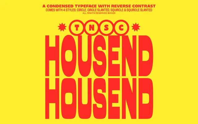
A condensed reverse-contrast display face with tall, narrow letterforms drawn from food poster and street market signage traditions.
About
Housend applies reverse contrast to a condensed display structure, giving its letterforms an energetic, slightly off-kilter quality suited to headlines, packaging and logo work. The proportions are deliberately exaggerated, referencing retro commercial graphics from diner menus, snack labels and burger shop signage. It works best at large sizes where the quirky contrast reversal reads clearly.
Classification
Housend uses reverse contrast — horizontal strokes thicker than verticals — combined with tall, narrow condensed proportions, placing it firmly in the display category with a retro commercial character.
Weights
Regular
Languages
Latin
Tags
reverse-contrastcondenseddisplayretropackagingsignagebrandingquirky