*MegaMegaTypeType*

On a mission to create the world’s biggest index of typefaces from the world’s best type foundries

sans-serifgeometric sanscondensed
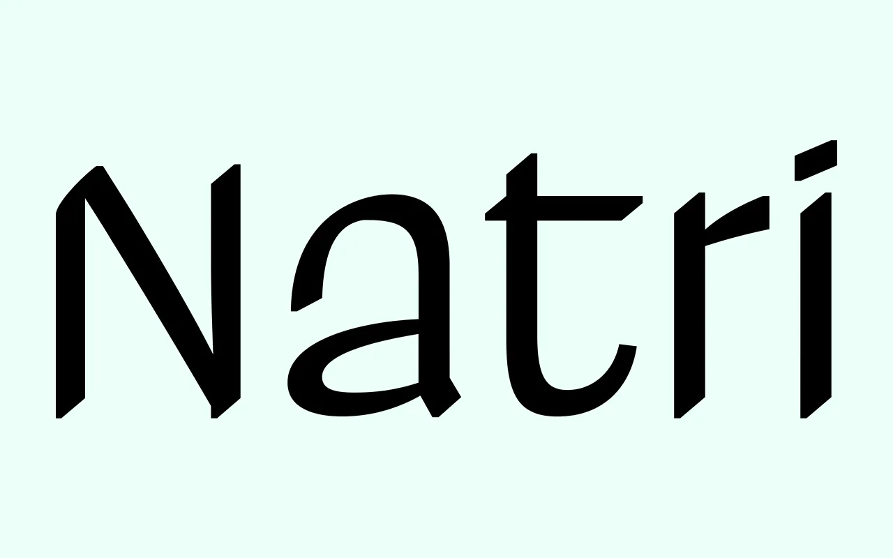
Natri specimen from DizajnDesign

A 2023 sans-serif that translates broad nib calligraphy and sign-painting caps into strict geometric forms, offering three widths across five weights for use in signage, display and corporate identity work.

About

Where most calligraphically inspired typefaces pursue a handmade feel, Natri deliberately replaces organic stroke endings with mechanical precision, producing letterforms that in certain combinations resemble architectural plans viewed from above. Three widths give it practical flexibility for sign-painting applications and constrained spatial conditions. The design was tested iteratively by hand with a brush, meaning the digital font and hand lettering can be used alongside one another in the same project.

Classification

A sans-serif drawing on broad nib calligraphy and sign-painting cap lettering, with strict mechanic-geometric stroke endings replacing any handmade quality. Its architectural proportions and calligraphic origins place it within a geometric sans tradition with distinctive display character.

Weights

RegularMediumBoldBlackHeavy

Optical sizes and widths

CondensedRegularWide

Languages

AfrikaansAlbanianAzerbaijaniBasqueBosnianCatalanCroatianCzechDanishDutchEnglishEstonianFaroeseFilipinoFinnishFrenchGalicianGermanHungarianIcelandicIndonesianIrishItalianLatvianLithuanianMalayNorwegian BokmålPolishPortugueseRomanianSlovakSlovenianSpanishSwahiliSwedishTurkishWelshZulu

Tags

geometriccalligraphicsign-paintingarchitecturaldisplayletteringwidecondensed