 MegaMegaTypeType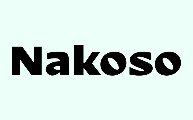
A Slovak sans-serif from 2018 with a conspicuously slanted contrast axis rooted in broad-nib calligraphy and American sign-painting traditions, offered in nine weights with matching italics and both text and display spacing.
About
The slanted contrast axis, borrowed from the visible pen angle of broad-nib calligraphy, gives Nakoso its defining character and lends the family its name. Capital letter construction draws on American sign painting, with middle bars placed slightly lower than conventional position. The nine weights span from Light headlines to text-optimised mid-range cuts, each with dedicated spacing and a full set of OpenType features including small capitals, old-style figures and true cursive italics.
Classification
A humanist sans-serif with a visibly slanted contrast axis derived from broad-nib pen calligraphy, giving it characteristics that sit between calligraphic and sign-painted letterforms rather than a neutral grotesque or geometric model.