 MegaMegaTypeType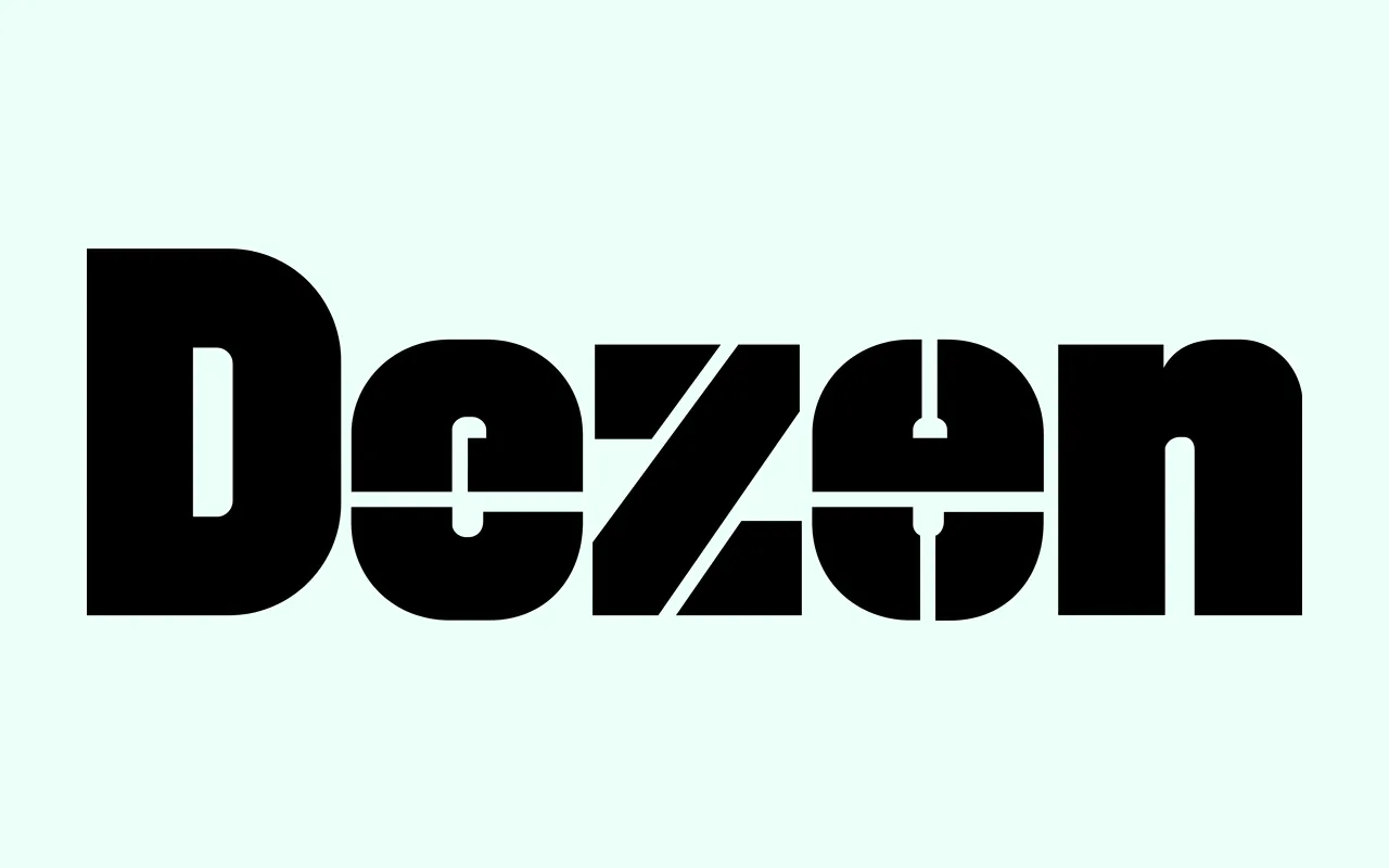
A narrow mechanical grotesque from 2010, built from modules and then optically corrected, in eight weights from Thin to Black.
About
Tight spacing and narrow proportions make Dezen a headline face first, though with extra tracking it will set short passages above 12pt. Dezen Pro cycles through the Solid and three Stencil styles in a fixed order, so a line of text forms a repeating pattern, which is what dezen means in Slovak. OpenType features include small caps, four stylistic sets and a full range of figure styles.
Classification
A narrow, tightly spaced grotesque built from modular parts and then optically corrected. Primarily a display face, with solid and stencil styles in the wider family.
Weights
ThinExtraLightLightRegularMediumBoldHeavyBlack
Family
Dezen SolidDezen Pro
Languages
EstonianEnglishSwedishItalianSpanishCatalanPolishFinnishFrenchSlovakGermanCzechDutchAfrikaansAlbanianBasqueBretonNorwegian (Bokmål)IndonesianLatvianLithuanianSloveneNorwegian (Nynorsk)PortugueseHungarianSorbianKurdish (Latin)HawaiianEsperantoWelshFaroeseIcelandicRomanianLuxemburgishRomaniTurkishSámi (Inari)Sámi (Lule)Sámi (Southern)FriulianGalicianKashubianFijianIdoSardinianScottish Gaelic
Tags
grotesquemodularmechanicalnarrowdisplayheadlinestencilpattern