 MegaMegaTypeType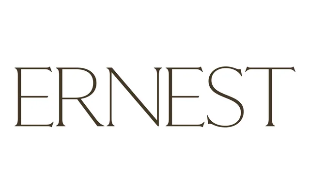
A modern serif debut with sinuous, minuscule serifs, the first Regular cut of a family still in progress.
About
Ernest departs from Claude Type's usual references with sinuous, minuscule serifs and broader thin strokes. Three years in development, its Regular weight launched in 2026 as the first cut of a fuller family still being built out, complete with inventive combining glyphs.
Classification
Sinuous, minuscule serifs and broader thin strokes on an otherwise conventional serif skeleton place Ernest in the serif category as a more modern departure for the foundry.
Weights
Regular
Languages
Latin
Tags
serifmoderneditorialin-progress