 MegaMegaTypeType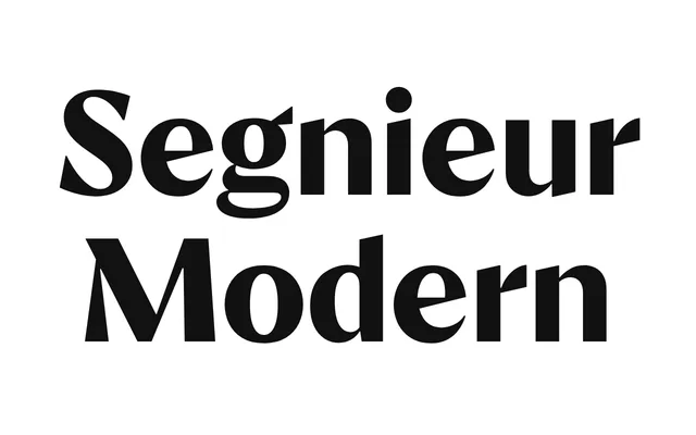
A high-contrast didone serif in the Didot and Bodoni tradition, designed for editorial and display use.
About
Segnieur Modern follows the rational geometry and extreme stroke contrast of classical modern-face romans, making it well suited to headline and editorial contexts. The design pairs vertical stress with fine hairlines and bracketed serifs in the manner of eighteenth-century French and Italian punch-cutters. It is available in a small range of weights with accompanying italics.
Classification
A didone-style modern serif with high stroke contrast and rational vertical stress, characteristic of the Didot and Bodoni tradition. The name 'Modern' signals its place within the classical typographic classification of modern-face romans.
Weights
RegularBold
Languages
Latin
Tags
didonemodernserifhigh-contrasteditorialclassicaldisplay