 MegaMegaTypeType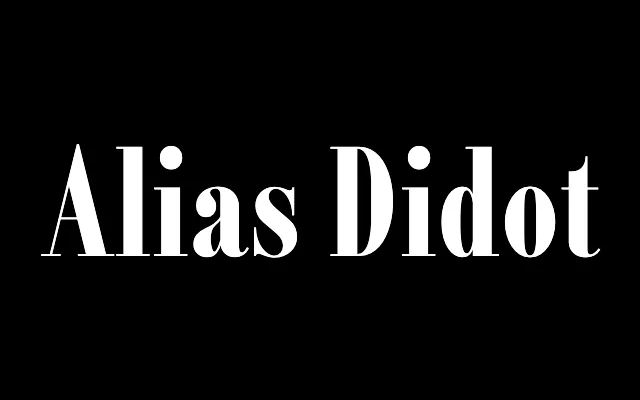
Condensed Didone designed for fashion editorial, with an italic that freely mixes Didot, Bodoni and invented shapes.
About
Alias Didot began as a pitch for a fashion magazine redesign – a few condensed uppercase characters expanded into a full family. It carries the sharp angular severity of the Didone tradition, but the italic is eclectic, mixing Didot structure with Bodoni conventions and custom numeral forms. The Black weight adds ball terminals at an unusual ratio and gains the graphic density of Fat Face display type.
Classification
Condensed Didone serif with the spare severity of the Modern face tradition. The italic departs from convention – mixing Didot structure, Bodoni conventions and invented numeral forms. The Black weight moves into Fat Face territory, with an expressive graphic density that Hague traces to 1970s New York design rather than classical precedent.