 MegaMegaTypeType
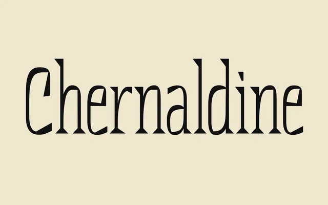
A bold, narrow display serif by Daria Litovchenko with big pointed serifs and a taste for the spotlight.
About
Chernaldine is narrow and high in contrast, with large sharp serifs and neatly finished strokes. Its roots are in pre-revolutionary Russian lettering and the experiments of the early 20th century, but it is drawn for current briefs. It works best in short, punchy messages.
Classification
A narrow, contrasting display serif with large sharp serifs and crisp terminals, drawing on pre-revolutionary Russian type and early 20th-century experiments.
Weights
Regular
Languages
LatinCyrillic
Tags
serifdisplaynarrowhigh-contrastsharphistoricalcyrillicheadline