 MegaMegaTypeType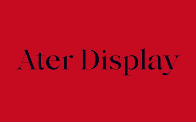
A high-contrast display serif by Nicolas Dupuis, spanning eight weights with italics and a variable file, designed to emphasise whitespace and refinement at large sizes.
About
Ater Display pushes the contrast between thick and thin strokes further than its text counterpart, lending it a more refined, elegant character suited to titling and large-scale layout work. The family runs from Extralight to Black, with matching italics across all eight weights, and supports a variable weight axis using a letter-blackening approach. Ligatures and extended glyph coverage for Latin European languages round out the offering.
Classification
A high-contrast serif with a contemporary character, drawing on classical serif proportions while emphasising the difference between thick and thin strokes for display use. The variable weight axis and letter-blackening approach position it firmly in the display serif category.