 MegaMegaTypeType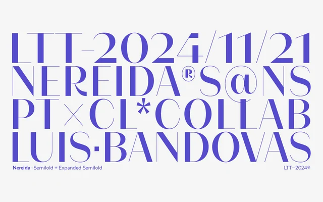
A high-contrast display serif in three widths, designed by Luis Bandovas for magazine headlines, packaging and beauty branding.
About
Nereida spans 21 styles across Condensed, Regular and Expanded widths, each available in seven weights from Thin to Bold. Its generous x-height improves legibility at moderate text sizes, while delicately crafted terminals, ligatures and initial letters extend its range into decorative applications. The family targets editorial, logo and packaging contexts where refined elegance is the priority.
Classification
High stroke contrast with delicate terminals and a generous x-height places Nereida firmly in the high-contrast display serif tradition, suited to editorial and fashion contexts rather than extended body text.
Weights
ThinExtraLightLightRegularMediumSemiBoldBold
Optical sizes and widths
CondensedStandardExpanded
Family
Nereida CondensedNereida Expanded
Languages
Latin
Tags
high-contrastdisplayeditorialfashionelegantligaturespackagingbeauty