 MegaMegaTypeType
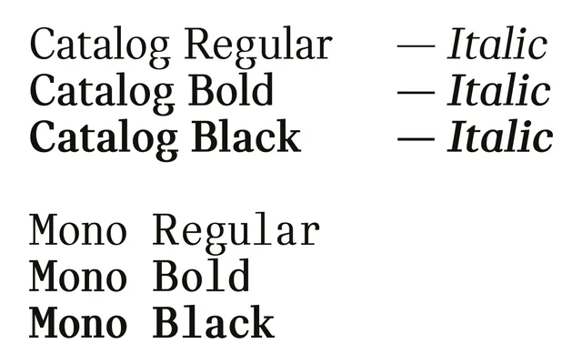
A constructed serif first drawn in 2005 for a contemporary art catalogue, now with a three-weight monospaced companion.
About
Catalog strips the classical serif back to a constructed logic: heavy verticals meet simplified linear serifs with no rounded corners and uniform horizontal cuts. Three weights come with italics, Cyrillic and Greek were added in 2017, and Catalog Mono, a typewriter-style companion in Regular, Bold and Black, joined in 2025.
Classification
A simplified, constructed serif with heavy vertical strokes transitioning to linear horizontal serifs, blending humanistic Antiqua structure with a graphic, classicist approach. The uniform horizontal cuts and reduced forms distinguish it from conventional transitional or old-style serifs.
Weights
RegularBoldBlack
Family
Catalog Mono
Languages
LatinCyrillicGreek
Tags
serifconstructedclassicisthumanistmonoeditorialdisplay