 MegaMegaTypeType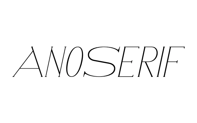
54-font geometric serif system built on Ano's circular framework, used in AnOther magazine for nearly two decades.
About
AnoSerif began as a headline for Another Man Issue 3 in 2006, then developed into a full 54-font system: six weights, each in nine variations (three style variants across three orientations – roman, italic and back-italic). The design applies Ano's Bauhaus-derived circular construction to a serif, creating tension between mathematical monoline geometry and the classical weight and angle of the serif letterform. It ran in AnOther and Another Man magazines from issue 15 onwards.
Classification
Serif counterpart to Ano, built on the same Bauhaus-derived circular geometry. The design sits the serif tradition – rooted in brush or chisel – against a mathematical, monoline construction. Nine style variations per weight (standard, upper-lower, wide, each in roman, italic and back-italic) produce 54 fonts across six weights.