 MegaMegaTypeType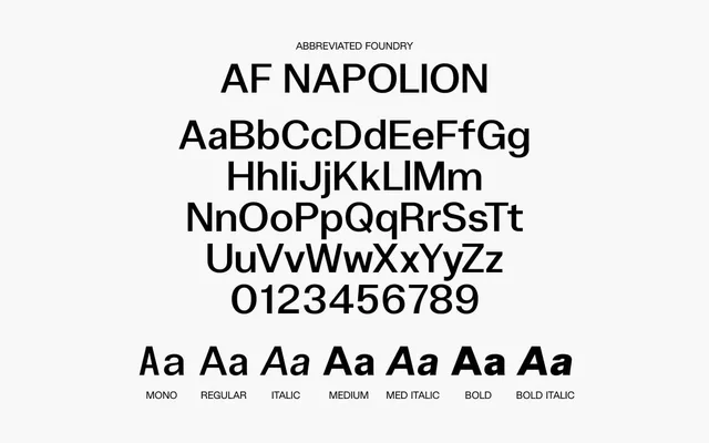
A high-contrast grotesque with sharp angles and abrupt terminals, offered in three weights with italics and a monospaced variant.
About
AF Napolion leans into blunt, uncompromising letterforms: sharp angles and clipped terminals give it a cold, commanding presence unusual among contemporary grotesques. The family spans Regular, Medium and Bold, each with a matching italic, plus a Mono cut and a small set of OpenType alternates for R, t, u, a and i. Glyph coverage includes Latin Extended-A and -B alongside standard mathematical and currency symbols.
Classification
A grotesque sans-serif characterised by sharp angles, abrupt terminals and striking stroke contrast, placing it firmly in the blunt, high-contrast grotesque tradition rather than humanist or geometric camps.