 MegaMegaTypeType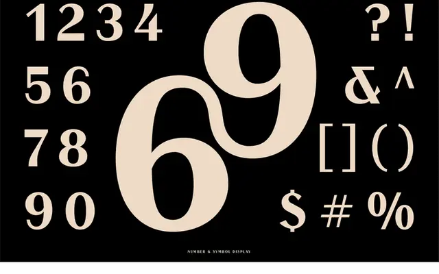
BN Nord is a contrasted display sans serif that applies a contemporary sensibility to the classic high-contrast sans tradition.
About
The typeface updates the conventions of the contrasted sans serif, a genre with roots in nineteenth-century display printing, with a cleaner and more contemporary execution. Stroke contrast is the primary formal device, creating visual tension between thick and thin elements within otherwise unadorned letterforms. It is aimed at logo, packaging and editorial headline use where a single weight carries the design load.
Classification
Described as a modern take on a classic contrasting sans serif; single weight implied, display-oriented.
Languages
Latin
Tags
displaysans-serifhigh-contrastmodernlogo