 MegaMegaTypeType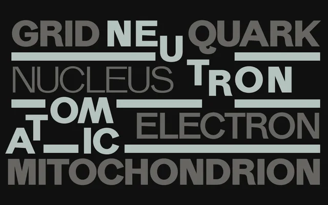
An experimental sans-serif with a 'backwards forms' stylistic set that mirrors selected letterforms to create an unsettling, springy visual rhythm across five weights.
About
AF Canas offers a conventional five-weight range from Light to Bold, but distinguishes itself through a suite of OpenType alternates including backwards forms, a loopy Q, wide M and multiple alternate cuts for a, r, t, G, g and q. The backwards stylistic set inverts specific glyphs such as B, K, R, S and several vowels, producing a disorienting forwards-and-backwards tension in running text. Glyph coverage extends to Latin Extended-A and B, mathematical operators, enclosed alphanumerics and a selection of geometric shapes.
Classification
A sans-serif with an unconventional, playful character achieved through a 'backwards forms' stylistic set that inverts and mirrors certain letterforms, giving it a distinctly experimental quality within the broader sans-serif genre.