 MegaMegaTypeType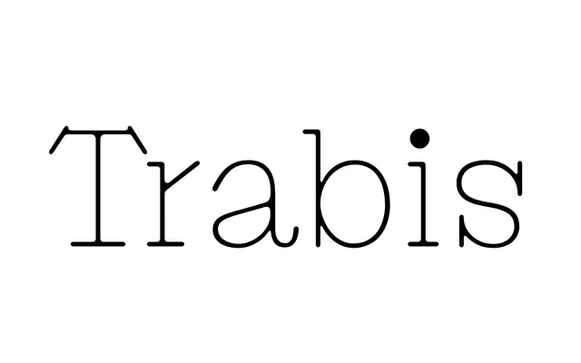
A single-weight display serif by Axel Pelletanche-Thévenart, built on digital letterform structures but finished with blurred serifs that recall the texture of an oldstyle typewriter.
About
Trabis takes its name from a Latin term for a structural timber, and carries that solidity through its steep lowercase 'r' and oversized capitals. Its punctuation and dots are rendered conspicuously black against the otherwise light weight of the face, adding rhythm and texture to set text. A stylistic set swaps in calmer alternates for Q, N, R and S for those who want less drama.
Classification
A serif with blurred, oldstyle typewriter-influenced serifs and digital letterform structures. Its display character is most apparent in its steep lowercase 'r' and large-headed capitals, placing it firmly in the display serif category.