 MegaMegaTypeType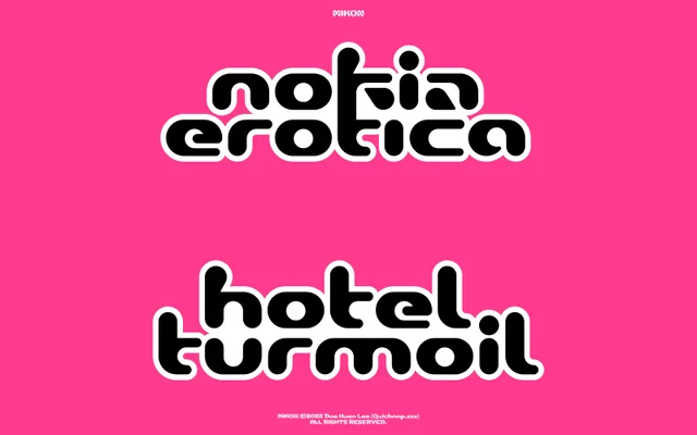
A single-weight geometric display face by Paris-based designer Dae Huen Lee, built around capsule-shaped rounded terminals inspired by levitating pod vehicles.
About
Mikon is a bold display typeface with uniformly rounded, capsule-shaped stroke endings that give it a soft, slightly inflated futuristic quality. Designed for headlines, logos and graphic applications, it covers Latin European languages across 382 glyphs – including ligatures, alternates, four numeral sets and prebuilt fractions. The designer, Dae Huen Lee (QUICKNAP.ZZZ), studied typography at École Estienne in Paris, and the technical implementation reflects that training.
Classification
Single-weight geometric display face with capsule-shaped, heavily rounded terminals throughout. The rounded stroke endings give it a soft, inflated quality distinct from traditional rounded sans-serifs. No stress axis visible; uniform stroke weight with a geometric construction. Futuristic in character rather than retro.