 MegaMegaTypeType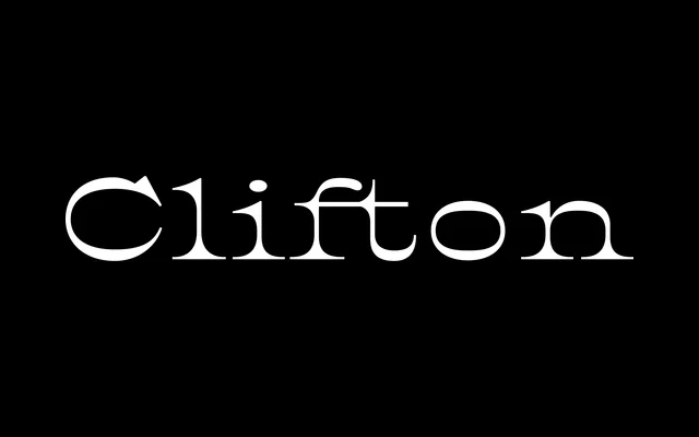
A revival of the 1896 British Type Foundry's Athenian, redrawn by Yoann Minet with a tall x-height and reduced contrast to serve as a body text face with an American bayou character.
About
Where most reversed-contrast serifs are purely display vehicles, Clifton's restrained contrast and generous x-height allow it to function at text sizes without sacrificing its raw, characterful presence. The roman carries the weight and sparkle of its inverted stress – heavy horizontals pooling into dark serifs – while the italic is an independent design: slender, mobile and markedly different in colour, creating a strong contrast within a composed paragraph. Its name honours Clifton Chenier, the Zydeco musician from French Louisiana, placing the typeface squarely within an Afro-Caribbean American cultural lineage.
Classification
Clifton uses inverted (reversed) contrast, a hallmark of Italian/Western display serifs, where horizontal strokes are heavier than verticals, with imposing serifs forming a dark focal point within each letterform. It draws directly from the Athenian typeface of 1896 and the American Type Founders' Fantail, placing it within the Italian/reversed-stress tradition.