 MegaMegaTypeType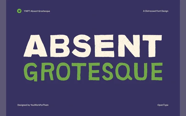
A deliberately imperfect grotesque sans-serif released in 2008, created collaboratively by three designers and distinguished from neutral Swiss grotesques by its raw, unpolished character.
About
Each of the three weights was crafted by a different designer, giving the family a varied texture that resists the homogeneity typical of grotesque revivals. OpenType alternates extend the expressive range, making it a practical choice for editorial work that benefits from a human, rough-edged quality. It has remained a consistent seller since release, particularly among American magazine designers.
Classification
A grotesque sans-serif with deliberately introduced imperfections and rough, organic qualities, positioning itself as a reaction against the refined neutrality of typefaces like Helvetica and Univers.