 MegaMegaTypeType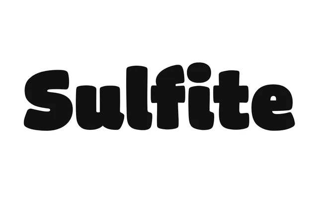
A 2024 six-weight sans-serif by Greg Lindy, developed with an organic process beginning at the heavy end of the spectrum to define the family's warm, deliberately imperfect personality.
About
Sulfite was built from the heaviest weights first, allowing the Extra Black to function as a standalone design rather than merely an exaggerated lighter cut. Personality traits then filtered down through the weight range, with lighter styles given a more practical orientation. Alternate letterforms extend the expressive range beyond the core character set.
Classification
A warmth-driven, organically developed sans-serif with humanist tendencies, characterised by deliberate imperfection and alternate letterforms. Its development from heavy weights downward gives the family a distinctive personality-led voice rather than a neutral or geometric approach.