 MegaMegaTypeType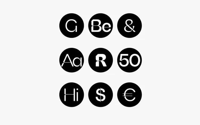
A geometric sans-serif in six weights that pairs classical grotesque structure with angular cuts and deep ink traps referencing 19th-century French Antiques.
About
FH Giselle sits within the geometric sans-serif tradition but departs from pure neutrality through deliberate angular incisions and pronounced ink traps, lending it a restrained yet distinctive character. Six weights from Light to Black provide a practical editorial range. The design positions itself as a contemporary reinterpretation of French Antique grotesques rather than a revival, balancing structural discipline with expressive detail.
Classification
A geometric sans-serif drawing on classical 19th-century French Antique grotesque traditions, distinguished by angular cuts and deep ink traps that push it beyond strict neutrality into expressive territory.