 MegaMegaTypeType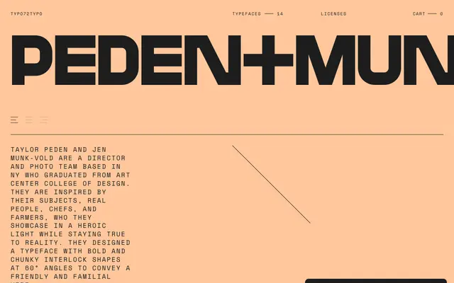
An all-caps geometric display typeface commissioned by New York photography duo Peden+Munk, built from bold interlocking forms at 60-degree angles with tight kerning and Norwegian character support.
About
Designed in collaboration with director and photo team Taylor Peden and Jen Munk-Vold, the typeface uses chunky, interlocking letterforms at 60-degree angles to project a friendly yet bold visual character. The glyph set is deliberately minimal, covering uppercase letters, numerals and a handful of symbols. Norwegian diacritics extend the Latin coverage beyond basic ASCII.
Classification
An all-caps geometric display face built around bold, chunky interlocking shapes set at 60-degree angles. The angular construction and tight kerning place it firmly in the experimental display category.