 MegaMegaTypeType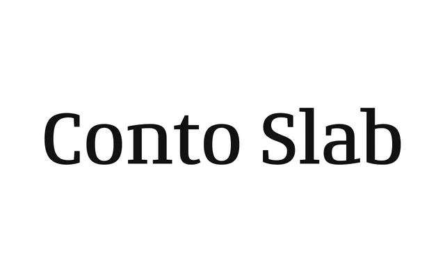
Part of the Conto superfamily, this slab serif in eight weights merges minimalist constructed forms with humanistic contrast and true italics rather than obliques.
About
Conto Slab applies slab serifs to Conto's simplified, humanistically contrasted letterforms, producing a typeface that feels simultaneously constructed and warm. Contrast is near-absent in the Thin and builds steadily to a punchy Black, making the lighter weights suitable for text and data-heavy settings while the extreme weights suit display work. A set of roughly 100 discretionary ligatures, accessed via OpenType, extends its usefulness into logotype and lettering work.
Classification
A slab serif with humanistic stroke contrast and constructed lowercase forms, combining minimalist grotesque-influenced shapes with slab serifs. Contrast increases progressively from Thin to Black, giving it a hybrid character between geometric and humanist traditions.