 MegaMegaTypeType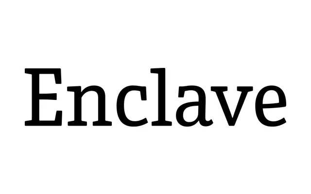
A slab serif built to shed the heavy 19th-century Egyptian character that limits most slabs, with narrow proportions in its lighter weights and lively italics throughout.
About
Enclave grew from work on how to set large passages of slab-serif text without the bulk of the 19th-century Egyptian tradition. Eight weights from Thin to Black run noticeably narrow at the lighter end, each with a matching italic, and Montalbano built in graduated weight steps meant for editorial and corporate work.
Classification
Explicitly pitched by the designer as a slab serif that avoids the heavy 19th-century Egyptian slab tradition. Proportions run narrow in the lighter weights, though no separate condensed product is sold. Recategorised here as slab rather than the original brief's Serif label, since the designer specifically calls it out as a slab-serif design.