 MegaMegaTypeType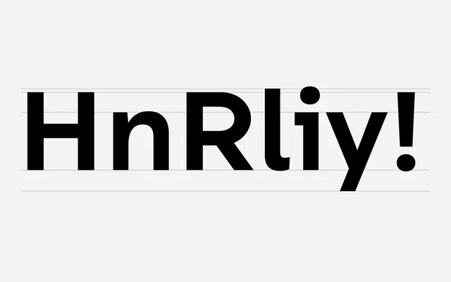
A geometric sans with humanist softening, covering Latin, Cyrillic and Greek across nine weights with matching italics.
About
Built on geometric foundations but shaped by open apertures, extended width and a generous x-height, it sits between the rational grotesque tradition and warmer humanist designs. Nine weights from Hairline to Extra Bold, each with an italic, provide a broad stylistic range for print and screen. Version 4 extended coverage to Greek, revised glyph contrast throughout, and added new arrows, manicules and currency symbols.
Classification
Primarily geometric in construction but tempered with humanist features such as open bowls and extended width, drawing also on the rational grotesque tradition of Akzidenz Grotesk. The generous x-height and open apertures distinguish it from pure geometric sans designs.