 MegaMegaTypeType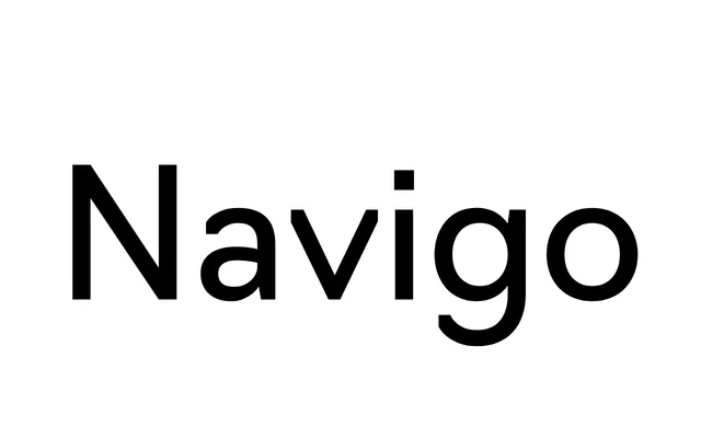
A geometric sans-serif created for the Moscow City District wayfinding system, offering seven weights with italics and broad Cyrillic and Latin coverage.
About
Commissioned for the wayfinding system and visual identity of Moscow City District, Navigo was built to perform across both text and display settings. Its low contrast and contemporary proportions make it highly legible at navigational scales, while an extensive code page covers extended Latin and Cyrillic scripts alongside navigational pictograms, tabular figures and fractions. The family spans seven weights from Thin to Black, each with a matching italic, totalling 14 styles.
Classification
A low-contrast geometric sans-serif with contemporary proportions, designed originally for wayfinding signage. Its even stroke weight and geometric construction place it squarely within the geometric sans tradition, though its large Cyrillic code page and navigational purpose give it a functional, utilitarian character.