 MegaMegaTypeType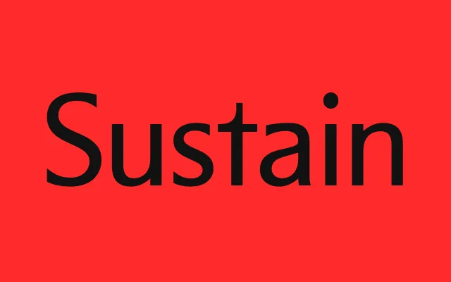
A humanist sans developed over eleven years that borrows asymmetric bowl construction from serif letterforms to produce a distinctive voice at both text and display sizes.
About
Designed between 2013 and 2024 and first released in 2016, it takes Karl Gerstner's Gerstner Original (1980) and Otl Aicher's Rotis (1988) as references. Curves join stems asymmetrically, most visibly in the lowercase n, while b and d carry asymmetric bowls that hint at a serif skeleton under the sans. Four weights from Regular to Black, with an italic, cover text and headlines.
Classification
Classified as a sans-serif despite borrowing structural cues from serif letterforms – asymmetric bowls on 'b' and 'd' and distinctive curve-to-stem connections echo serif construction. The designers cite Karl Gerstner and Otl Aicher as references, placing it within the humanist sans tradition.