 MegaMegaTypeType
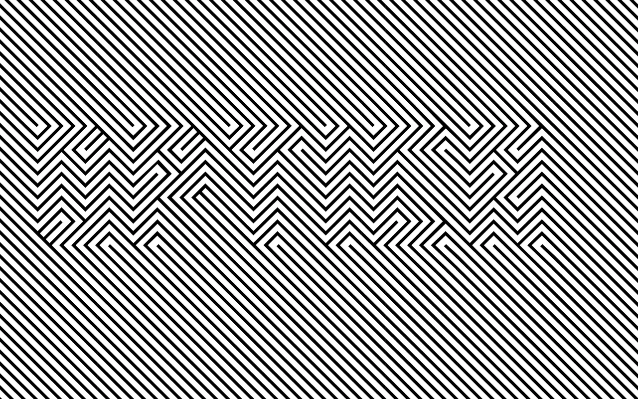
Op art as a font: letters drawn in diagonal stripes that switch direction against a striped ground.
About
Optica sets every letter as a block of diagonal stripes that turn at the letter's edges, so words surface from the pattern instead of sitting on top of it. It reads best big and given a moment, which makes it a fit for record sleeves, posters and motion work. Normal and Negative styles reverse the stripes, and it won a Type Directors Club certificate of excellence in 2010.
Classification
Experimental optical-art face: letters are fields of diagonal lines that change direction inside the letterform, so words appear through interference with the striped ground rather than as solid shapes. Two styles, Normal and Negative (reversed). Geometric and modular. Certificates of excellence from the Bienal de Tipografía Latinoamericana (2009) and the Type Directors Club (2010).