 MegaMegaTypeType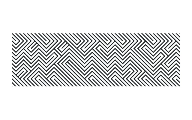
A two-style display typeface built from orthogonal lines that generates simultaneous texture and legible text as an optical illusion, honouring Colombian Op Art pioneer Omar Rayo.
About
Optica constructs its letterforms entirely from orthogonal lines joined in a fixed sequence, producing a dual visual effect: at first glance the eye reads a repeating geometric pattern; after a few seconds, the text itself resolves. The typeface pays tribute to Colombian artist Omar Rayo, a central figure in Op Art, and performs best at large sizes where the perceptual tension is most effective. It comprises two styles, Normal and Negative, and received a Certificate of Excellence from the Type Directors Club in 2009.
Classification
Constructed entirely from orthogonal lines arranged in a fixed order, Optica creates an optical illusion effect inspired by Op Art, placing it firmly in the display category with a highly experimental, perceptual character.