 MegaMegaTypeType
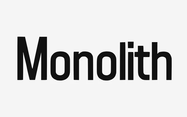
A single-weight sans from The Type Foundry that sits between humanist and geometric, pitched at long-form reading and tightly tracked headlines alike.
About
Monolith's open apertures on a, c, e and s keep it legible in dense text and on screen, while its tall, upright forms turn hard-edged once set big and tracked in. The foundry presents it as one face with two temperaments: quiet in body copy and UI, assertive on posters and headlines. It comes in a single Regular style with no italic.
Classification
The foundry calls it a dual geo-humanist sans: humanist open apertures and natural proportions for text, with tight, upright, near-geometric forms that sharpen up when set large and tracked in.
Weights
Regular
Optical sizes and widths
Normal
Languages
Latin
Tags
humanistgeometrictextheadlineseditorialuibrandingsingle-weight