 MegaMegaTypeType
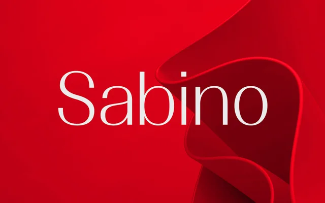
A calm, slightly tapered sans in four weights that works for cultural branding and editorial at both text and display sizes.
About
Sabino starts from clean geometry and then eases it with tapered strokes and open apertures. The light weights are airy enough for refined editorial work, while the bold carries weight without going blunt. A sculpted A, a long Q tail and a fluid ampersand give it character at large sizes.
Classification
Geometric in its skeleton but softened by gently tapered strokes, open apertures and calligraphic details in the A, Q and ampersand. That mix of geometric structure and humanist finish places it between the two, leaning humanist.
Weights
LightRegularMediumBold
Languages
Latin
Tags
humanistsans-serifeleganteditorialbrandingtextdisplayuiwayfindingcontemporary