 MegaMegaTypeType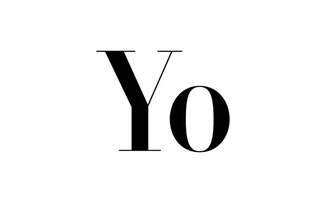
A Didone super-family built as a width system rather than a weight system, sold as five named cuts running from the narrow Yo Andy to the wide Yo Zelda.
About
Yo is Montalbano's Didone design, in the Didot and Bodoni tradition, taken apart along a width axis instead of the usual weight axis. Twenty numbered cuts, One to Twenty, each with an italic, run from narrow to wide, and five points along that range are sold as their own named complete families: Yo Andy at the narrowest end, Yo Zelda at the widest, with Yo Lucy in the middle and Yo Frankie and Yo Sophie between them. Montalbano has said a name starting with A sits at the narrow end and one starting with Z at the wide end, by design.
Classification
A Didone family in the Didot/Bodoni tradition, built as a width system rather than a conventional weight family: each of twenty numbered cuts, One to Twenty, is available with italics, and five of those width points are sold as named, independent complete families, Yo Andy (narrowest), Yo Frankie, Yo Lucy, Yo Sophie and Yo Zelda (widest), with Andy naming the letter closest to the front of the alphabet for the narrowest width and Zelda the widest. The original brief listed only Yo Andy as a Sans family; this corrects both the category, which is serif, and the scope, since Frankie, Lucy, Sophie and Zelda are separate named products within the same system not mentioned in the original list.