 MegaMegaTypeType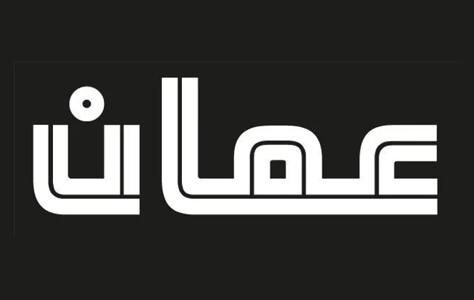
An Arabic display typeface from 2012, built on a concept of two parallel lines that carve out negative space to define each letterform.
About
Originally commissioned for a sports television channel, Khoutout (meaning 'lines' in Arabic) uses a consistent two-line graphic rule to construct its letterforms, creating a striking inline effect. The approach results in a highly recognisable typeface suited to large titles, screen animations and corporate identity work. It supports Arabic OpenType features and is intended for use in Middle East editions of Adobe applications.
Classification
An Arabic display typeface built on a strict graphic concept of two parallel lines forming letterforms, giving it a distinctly geometric and decorative character suited only to large sizes.