 MegaMegaTypeType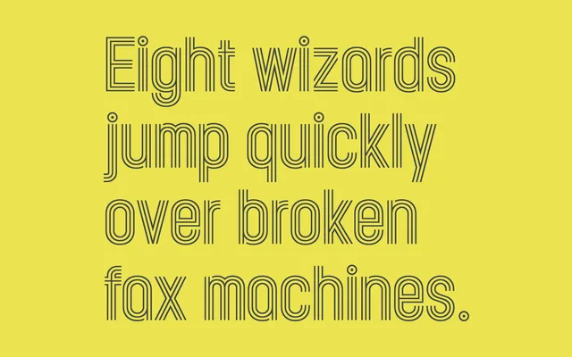
A tri-line geometric display family in three weights, built around a lozenge form with sharper right-angle joins that distinguish it from Lance Wyman's 1968 Mexico Olympics lettering.
About
Kandel 105 is the sharper of two variants in the Kandel family, featuring conventional angled joins at characters such as A, M, N, V and W rather than forcing the lozenge form on every glyph. The tri-line construction covers both upper and lower case, which the designer notes is rare for this style. Strictly a headline and poster face, it carries the visual language of athletics and sport without being confined to it.
Classification
A modular, tri-line geometric display face built around a lozenge form, with sharper right-angle joins at key characters. Its monoline, condensed construction places it firmly in the display category with no practical text application.