 MegaMegaTypeType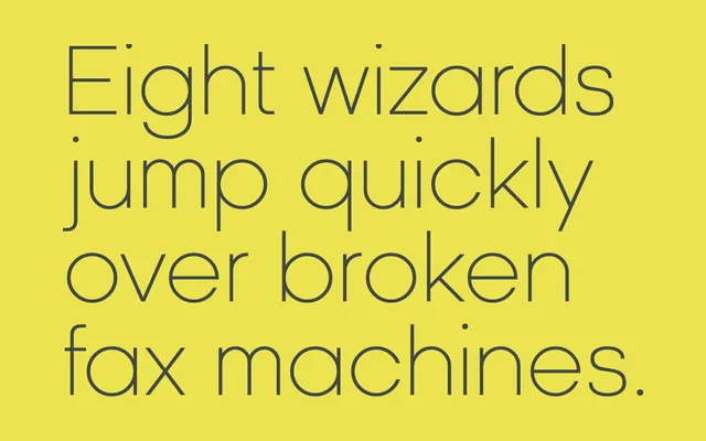
A text-optimised geometric sans with traditional proportions and a distinctly round lowercase, designed as the continuous-text counterpart to the display-weight Kamerik 105.
About
Kamerik 105 Text shares the visual character of Kamerik 105 but rebalances its proportions for sustained reading: the x-height is shallower and ascenders and descenders are longer, reducing the line width required for a given point size. The result is a more space-economical setting without sacrificing the geometric, round quality that defines the family. It is intended to pair with Kamerik 105 at display sizes or with the slab-serif Kettering 105/205.
Classification
A geometric sans-serif with a notably round lowercase, designed as a text-optimised companion to Kamerik 105, featuring more traditional proportions with a shallower x-height and longer ascenders and descenders for economical continuous text setting.