 MegaMegaTypeType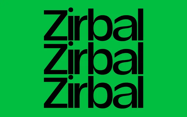
A 21-style display family by Daniel Stuhlpfarrer spanning three widths and six weights, inspired by the Swiss Stone Pine and distinguished by tight default spacing suited to headlines and brand identities.
About
Named after the Swiss Pine (Arve or Zirbelkiefer), the design takes its character from tight spacing and a structural rigidity that reads as contemporary rather than austere. The family stretches from Condensed to Extended across six weights from Thin to Bold, with a two-axis variable font covering the full range. A 687-glyph set includes small caps, old-style figures, fractions and a bespoke asterisk drawn from a pine cone cross-section.
Classification
A display and headline typeface with multiple widths from condensed to extended, designed primarily for large-scale use in headlines, posters and brand identities. Its very narrow default spacing and three-width structure place it firmly in the display category.